Wednesday, February 25, 2015

How deep is the hole?

A recent report on debt and deleveraging from McKinsey attracted some attention, due in part to the location of Ireland in a few of the key charts.  Ireland is shown to have had the largest increase in debt as a proportion of GDP since 2007 with the overall level of debt in the economy put at 390 per cent of GDP.

We have looked at the relevance of such statistics many times before – such as here, here and here.  We will do the same here but using data from the Institutional Sector Accounts and revised Balance of Payments statistics being produced by the CSO under BPM6.

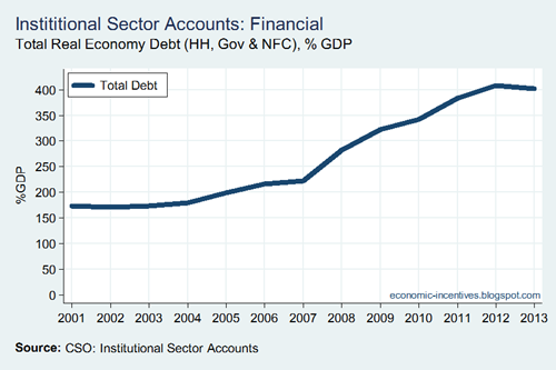
The measured level of debt in Ireland rose steadily from 2003 to 2007 during the credit bubble but then somewhat counter-intuitively accelerated rapidly when the crash hit in 2008.

Total Debt

Obviously, government borrowing accounts for some of this but the scale of the increase is significantly greater than can be explained by the fiscal deficits.  As can be seen in the chart below the debts of non-financial firms also accelerated in 2008 which runs counter to the narrative of the busting of the credit bubble.

HH NFC and GOV Debt

The 2013 figures in the above charts are:

  • Household Debt: 96% of GDP, €168 billion
  • Non-Financial Corporate Debt: 174% of GDP, €303 billion
  • Government Debt: 132% of GDP, €232 billion
  • Total Debt: 402% of GDP, €703 billion

The measure of government debt includes the debts of the IBRC which was initially left in the financial sector when it was established but has since been re-categorised as part of the government sector.  This was a significant factor in 2011 and 2012 but the liquidation of the IBRC that began in February 2013 has reduced its impact on the government’s balance sheet.

Two key issues need to be addressed:

  1. Is the hole really €700 billion? If it is we’re goosed.
  2. What explains the rise of the red line (NFC debt) in the above chart?

We answered these questions before but here we will look at them using revised balance of payments and international investment data from the CSO. 

An important measure for any economy is gross external debt: the amount borrowed from foreigners.  For Ireland there is the complication of the IFSC (which has external liabilities – and assets! – of several trillion).  However, the CSO also provide this data excluding the impact of the IFSC.

External Debt

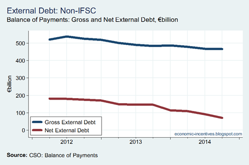
The updated data series is not lengthy but we can see what has been happening recently.  Ireland’s gross external debt is falling, albeit slowly, but is still around €465 billion.  That is a big hole.

The measure of net external debt accounts for the foreign assets in debt instruments held by residents.  That has fallen below €100 billion.  However, we cannot say that those who who have the foreign debt liabilities also hold the foreign debt assets. 

We can examine this by looking at the sectoral breakdown of the gross external debt.

External Debt by Sector

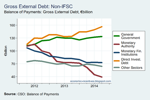
This is an instructive breakdown.  The continued increase in the external borrowings of the government sector well understood.  It can be seen that the external liabilities of the monetary authority (Central Bank of Ireland) and monetary financial institutions (the banks) have been declining rapidly as the banks deleverage and repair their balance sheets.

What is most notable is the increase in external debt associated with direct investment which has risen to €160 billion (almost 100 per cent of GDP).  This is the external debt of MNCs in Ireland.  This is the sector that has shown the greatest increase over the past few years and is what accounts for the increase in the red line in the second chart from the top.

So that answers one question. NFC debt is increasing because of the activities within the MNC sector – mainly intra-group treasury operations.

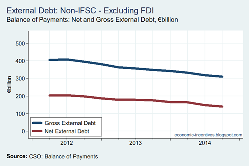
Using these we can reconsider the gross and net external debt figures but excluding the impact of FDI.  Doing so gives the following result.

External Debt by Sector ex FDI

Excluding the external liabilities of MNCs reduces Ireland’s gross external debt to around €300 billion (while excluding the external debt assets of the MNCs actually increases Ireland’s net external debt to €140 billion).  The downward slope of the blue here contrasts with the upward slope of the blue line in the first graph.  What we see here is a better indicator of where we are and where we’re going.

A gross external debt of €300 billion is around 175 per cent of GDP.  This is a significant external debt burden but is a long way from 400 per cent of GDP.  There has also been a rapid fall in this measure of external debt which has been reduced by around €100 billion in early 2012 when it was just over €400 billion.

Obviously the overall amount of debt in the economy is greater than €300 billion but the money owed to non-residents is a key indicator.  The banking sector in Ireland moved to a net international investment position of near balance after the collapse(though was largely replaced by an external debt by the Central Bank which has since reduced).  While we have unresolved domestic issues with household debt through mortgages and debts in the SME sector our external debt position has improved markedly (and probably wasn’t as bad as some headline figures may have suggested). 

A major determinant of any default event is external debt and outward interest flows. The reduction in external debt and the extremely low interest rates mean that this outflow is declining.

  • How do we make it fall further? There are four steps that can be taken.

    1. Stop borrowing more from abroad.  The government sector is the only domestic sector that continues to borrow more from abroad.  This may be drawing to a close.
    2. Repay debt from income.  Ireland is running a current account surplus which can provide the resources to repay debt.
    3. Repay debt by selling assets.  Asset sales to non-residents are likely a significant factor in the recent in the external debt fall. 
    4. Default. 

    Even if the rate of reduction moderates somewhat using steps 1, 2 and 3 our gross external debt should be down to 100 per cent of GDP by the end of the decade and may be even lower.  Yes, we’re in a hole (one that is around 175 per cent of GDP) but we’re climbing out of it.

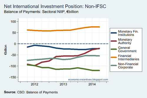
    This improvement in our external position is also evident if we look at the net international investment position which accounts for all external assets and liabilities and not only those in debt instruments.  First, here’s the NIIP by sector (excluding the IFSC of course).

    Net International Investment Position by Sector

    The continued deterioration in the position of the government sector is evident as is the improvement in the external position of the Central Bank.  Financial intermediaries is likely dominated by the pension savings of Irish residents which are invested abroad.

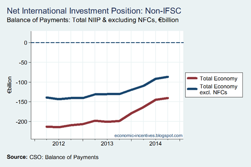
    And finally here’s the overall NIIP for the Irish economy with the NIIP shown excluding NFCs also shown (as it is the MNCs that dominate the external position of the NFC sector).

    Net International Investment Position

    It can be seen that the NIIP excluding NFCs has improved by about €50 billion over the past 2.5 years. This is less than the €100 billion reduction in our gross external debt. This can arise if foreign assets are sold to repay foreign debt (meaning the NIIP is unchanged). Foreign assets by sector (bar NFCs) are shown in the chart here – yes, the banks have reduced (sold?) some foreign assets.

    Still a bit to go until we get to zero but we’re getting there.  I’d also guess the CSO still have a bit of work to go in moving to ESA2010 and BPM6 but they’re getting there too.
  • Thursday, February 19, 2015

    Core Inflation Unchanged

    The overall annual CPI inflation rate dipped down to –0.6% in January but the ‘core’ rate (excluding energy products and mortgage interest) was largely unchanged (0.8% in December versus 0.9% in January).  This was the result of the new inclusion of water and sewage charges to the CPI which added 0.4pp to the annual rate in January.

    Inflation Jan 15

    Thursday, February 12, 2015

    The same rates of tax? Yes, but for very few.

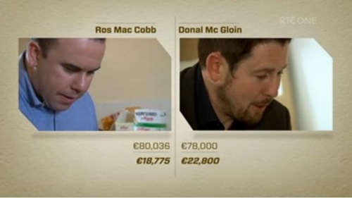
    On last Monday’s Claire Byrne Live, commentator Eamonn Dunphy made the following comment:

    “As we do in Ireland, the French pay a high rate of tax but in return they receive the kind of services that the average Irish citizen can only dream of.”

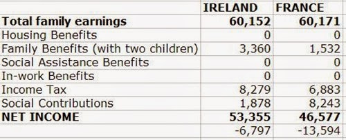
    The only evidence to support this was some limited figures from a two-earner family with children in both Ireland and France.

    CB Live Screenshot

    The top figure is each case is “joint income” while the bottom figure reflects “tax and PRSI after tax credits and pension contributions” for the couple living in Ireland (on the left) and “income tax and social insurance” for the couple living in France (on the right).  It is also possible that the comparison is clouded as being between public and private sector workers.

    A major issue is that these households cannot be considered representative – they are from the top of the income distribution and probably in the top decile of the distribution.

    Ros says:

    “I believe the taxes we are paying should be sufficient to provide a ‘world-class’ public service unfortunately it doesn’t seem to be that way it seems our taxes are being used to pay for other things.”

    The suggestion in the discussion was that earners in Ireland were paying similar taxes to those in France but getting far less in return.  The reality is somewhat different.  The truth is that most earners in Ireland pay far less income tax and make far lower social contributions than their French counterparts.  The only cases in which this is not true is high earners and that was the only “evidence” presented.  And this ignores employer’s social insurance contributions which are about three times higher in France than in Ireland.

    Here we will look at the impact of the tax and transfer system on eight household types using the Tax-Benefit Calculator of the OECD.  The latest year of the calculator is 2012 but there have not been fundamental changes in how each country tax income in the interim.  All the data used here is taken from the calculator so queries can be sent to the OECD!

    The following Average Industrial Wages (AIW) are used for 2012:

    • Ireland: €32,514
    • France: €36,248

    The household types for which a measure of “effective tax rates” are presented for incomes ranging from 50-200 per cent of the AIW are:

    • Single Person, 0 Children
    • Single Person, 2 Children
    • Couple, 1 Income, 0 Children
    • Couple, 1 Income, 2 Children
    • Couple, 2 Incomes, 0 Children (Income 2 = 67% AIW)
    • Couple, 2 Incomes, 2 Children (Income 2 = 67% AIW)
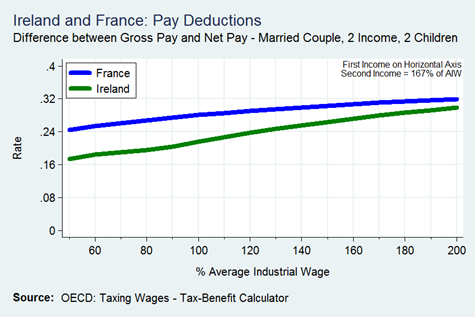
    • Couple, 2 Incomes, 0 Children (Income 2 = 167% AIW)
    • Couple, 2 Incomes, 2 Children (Income 2 = 167% AIW)

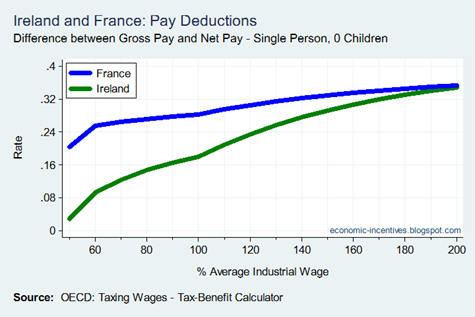
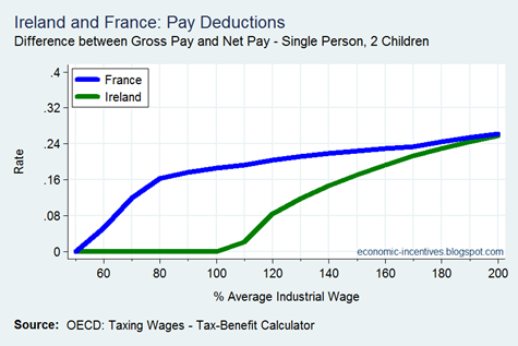
    First are two charts for a single person, one with no children and then with two children.  The income range in Ireland is €16,257 to €65,029 while for France it is from €18,124 to €72,495.  At almost all incomes levels the impact of the tax and benefit system is much less in Ireland than in France. 

    Up to 110 per cent of the AIW it means that net pay is higher in Ireland even though gross pay starts out lower.  For example at 110 per cent of the AIW, gross pay in Ireland is €35,766 and in France is €39,872.  Net pay is calculated to be €28,301 in Ireland and €28,131 in France.

    The progressive nature of the Irish system means that the gap between the rates narrows and is all but eliminated at 200 per cent of the AIW.

    Single Person 0 ChildrenSingle Person 2 Children

    For a single person with children the gap at lower incomes is even more pronounced.  For instances where the earner gains from the tax and benefit system (due to Child Benefit or the Family Income Supplement in Ireland) the rate is set to zero rather than show negative rates.  The gap below 100 per cent of the AIW is even greater than shown above.  Again the gap is eliminated at high incomes. 

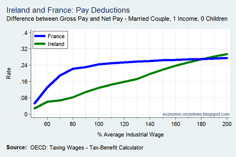
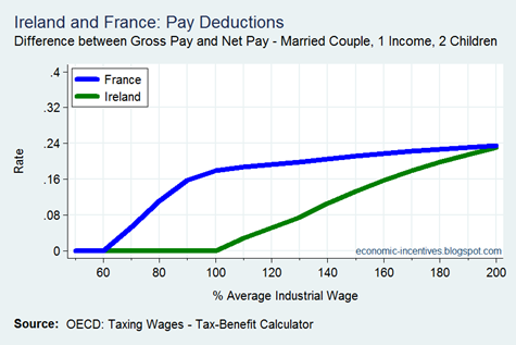
    Next we look at married couples with one income.  The income ranges are as for the single person charts above.  The story is largely the same: a large difference at low incomes levels which is eliminated at high income levels.

    Married Couple 1 Income 0 ChildrenMarried Couple 1 Income 2 Children

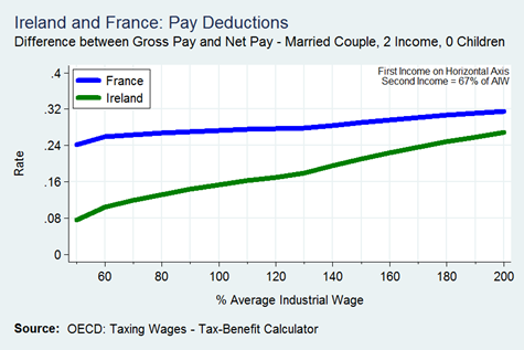
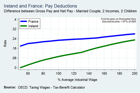
    The next two charts concern a dual-income household where the second income is 67 per cent of the AIW.  For Ireland the combined income ranges from €38,042 to €86,814 while the French figures range from €42,410 to €96,781.

    Married Couple 2 Income (67) 0 ChildrenMarried Couple 2 Income (67) 2 Children

    At a gross pay level of €60,000 a 2-earner, 2-child couple with in Ireland will have a net pay around €6,800 lower after taxes and benefits.  In France the gap would be €13,600.

    60k comparison

    Finally we come to the higher earners.  Here the second income is 167 per cent of the AIW.  The income range for Ireland is €70,556 to €119,328 and €78,675 to €133,029 in France.  For both the no child and two children couples the rate in Ireland is lower and the gap is small at the upper end of the range.

    Married Couple 2 Incomes (167) 0 ChildrenMarried Couple 2 Incomes (167) 2 Children

    So, yes there are some people in Ireland who do pay a similar high rate of tax and social insurance to earners in France – those with high income.  The vast majority of people pay much lower rates than earners in France. 

    What do the French do with all this extra money they collect from people? They give it back to them in pensions, with those who paid the most getting the most back.

    The French health system also got an airing.  France has a universal health system.  This does not mean it is free; it means everyone is treated the same.  The French system can be summarised are “pay and get reimbursed”.  Everyone pays the (regulated) prices for medical services and then is partially reimbursed.

    A typical visit to a GP costs €23 up front with €16 later reimbursed to the patient.  The net cost is thus €7  - for everyone.  For medicines, the standard reimbursement is 65 per cent of the cost, though the reimbursement is applied by the pharmacist rather than subsequently.  Again everyone faces the same prices.  More details here.

    In Ireland we have a binary system where some patients face zero, or near zero, prices and others face the full prices (though can get some reimbursement through the tax system).  Free comes at a high cost as was usefully explained a number of years by a public health nurse in a letter to the Irish Independent.

    We can have a “French-style” system in Ireland but it must be recognised what it would entail:

    • The vast majority of people (i.e. except high earners) paying much more in tax and social insurance, and
    • A large amount of people (the 1.9 million with medical cards) facing a price for medical services that were generally “free”.
    • Using a good part of the social contributions from high-earners to fund contribution-based pensions which go largely to high earners.

    There was no mention of these details last Monday though.

    National Debt Interest: What do we spend €7.5 billion on?

    The December Exchequer Returns showed that €7,466 million of interest expenditure was incurred by the Exchequer in 2014.

    2014 Non-Voted Current Expenditure

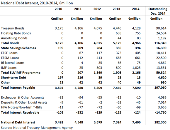
    This is only what happens above the water.  Here is a breakdown of the interest costs by type of debt from a recent PQ (HT: Kevin).  The outstanding amounts for the end of the year are also shown on the right but it should be noted that the interest paid reflects the amounts owed throughout the year rather than just at the end.

    National Debt Interest

    The €7,466 million is actually €7,590 million of interest paid with €124 million of interest received set against it.

    The largest individual item is the €4.1 billion paid out on Treasury Bonds.  Some of this goes to the nationalised banks (AIB and PTSB) so does not leave the State sector (broadly defined).  Some goes to the ECB and NCBs of the euro area as they purchased Irish  government bonds as part of the Securities Market Programme (SMP).  However, unlike with Greece this interest is not recycled back to Ireland.

    It can be seen that €755 million was paid on the Floating Rate Bonds.  All of this is paid to the Central Bank of Ireland which will return most of it to the Exchequer as part of its surplus income.

    The State-Savings Schemes run by the NTMA resulted in €394 million of interest expenditure.  This is an intra-country transfer as it is likely almost all of the money in these schemes comes from Irish households.

    Just under €2.2 billion of interest was paid out on the €67.5 billion of loans taken out as part of the EU/IMF rescue programme.  Almost half of this interest was paid to the IMF.  It should be noted that the €13.5 billion outstanding amount of IMF loans at the end of the year reflects the repayment of €9 billion to the IMF in the middle of December.  Another €9 billion is due to be repaid in 2015 which will further reduce interest expenditure.

    Around €0.4 billion in interest was paid on €18.5 billion of loans from the EFSF (the euro area rescue fund) at an interest rate of just over 2 per cent.  Greece has €140 billion of loans at a similar interest rate from the EFSF but doesn’t begin paying interest until 2023.  The interest due is rolled up into the overall capital amount.

    [UPATE: A separate PQ shows the current interest rate applicable to the different loans drawn down under the EU/IMF programme. Again HT to Kevin.]

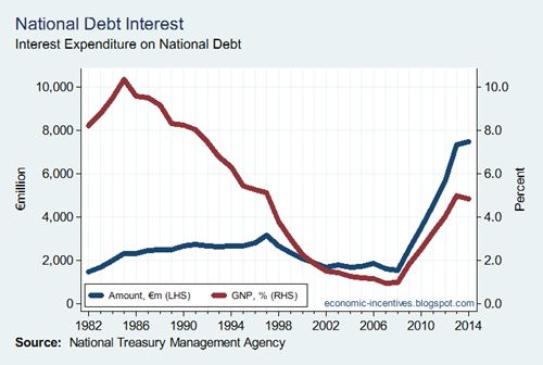
    The interest burden has increased in recent years but is not unique in a historical context.

    National Debt Interest 2

    Interest exceeded 10 per cent on GNP in 1985 and the current peak (2013) was roughly at half that level, though double-digit inflation did aid the reduction in the 1980s as lower interest rates and rapid growth did in the 1990s. 

    [It should also be noted that the above is based on two different GNP series as GNP was measured differently prior to 1995 and does not reflect current national accounts methodology (such as FISIM and the capitalisation of R&D).  Still the overall pattern will be pretty much as shown.]

    The current level of debt interest is high but it was expected to be higher.  Here is a figure from the National Recovery Plan published in November 2010.

    NRP Interest

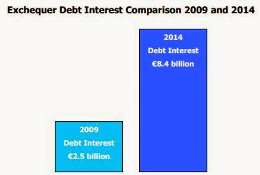
    I’m not sure that drawing a figure for two numbers was entirely necessary  but we get the picture.  National debt interest expenditure was expected to be €8.4 billion in 2014 and that was under some rather benign assumptions in the four-year plan.  As we have seen it turned out be almost a billion less.  Of course, the interest savings weren’t banked; they were used to run larger primary deficits.

    [Yes, this is not a like-for-like comparison – the Promissory Notes and all that.  Let’s not go there.  If we got into it we’d probably find that interest was about €1.5 billion lower than projected.  The PNs didn’t generate an interest charge on the Exchequer while the FRNs that replaced them do yadda, yadda, yadda.]

    The reason for the lower interest cost is straightforward - lower interest rates rather than less debt.  Can the interest bill be reduced further? Probably.  A cessation of borrowing would help but that is another two or three years away at best (is that an election I see in the distance?).  Debt transactions by the NTMA will help such as the early repayment of more of the IMF loans (it could be viewed as 7-year debt at four per cent being replaced by 30-year debt at two per cent).

    Towards the end of the EU/IMF programme the NTMA did a lot of work to buy back debt and extend maturities away from the immediate post-programme period.  This made for a relatively smooth exit from the programme but means we are not in a position to make use of the extremely low interest rate environment that exists now.  Bonds maturing over the next few years are:

    • 2015: €2,261m
    • 2016: €8,157m
    • 2017: €6,416m
    • 2018: €9,284m
    • 2019: €14,542m
    • 2020: €20,892m

    There is “only” €10 billion between this year and next.  Redemptions do ramp up in 2018 and the NTMA will be advance planning for that but it would actually be better if interest rates started to rise as that would be indicative of some sort of economic recovery and, heaven forbid, even a bit of inflation.  This would mean they may be no significant increase in real interest rates.  There are also banking assets to be sold but most of that money comes under the remit of the NPRF (now ISIF) though whether the proceeds will actually go there remains to be seen.

    We could look to earn more interest from the cash reserves that the NTMA are holding.  This should be possible as the interest received is pitiful compared to the amounts held but it is likely there are rules on what can be done with this money – at least one presumes there are such rules!

    The forthcoming QE programme from the ECB will likely see the Central Bank of Ireland hold even more Irish government bonds but it is not clear whether that will result in much of a surplus to recycle back to the Exchequer. This is because the CB will purchase the bonds in secondary markets at the current abnormally low yields.  Still even the current 1.25 per cent on ten-year bonds will help.

    Overall it looks like debt expenditure in the Exchequer Account will be stable at around €7 billion over the next few years (with a portion of that going to state-owned or state-controlled entities).  This is a massive increase from the  €1.9 billion of debt interest expenditure incurred in 2006 but it looks like it can fall a proportion on national income over the coming years.

    Monday, February 9, 2015

    Is a debt write-down what Greece really needs?

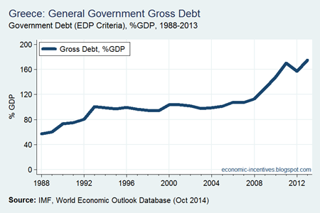
    The story of Greek government debt is a well-worn path.  Greek public debt has ballooned to unprecedented levels in the last few years.

    Greek Debt to GDP

    The 2012 default is just about evident and by the end of 2013 the debt ratio had already returned to the 2011 level.  But is the stock of debt such a massive burden that a write-down is what is needed to help kick-start the Greek economy?

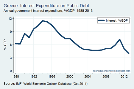
    If we look at interest expenditure as a percentage of GDP we see that it has not been lower in the past quarter of a century.

    Greek Interest to GDP

    From 1988 to 2013, public interest expenditure as a percentage of GDP averaged 6.9 per cent; in 2013 it was 4.0 per cent. 

    And this excludes two measures that have been introduced as part of the Troika programmes:

    • Any interest paid on Greek government bonds to the ECB or the different NCBs is recycled back to Greece (c.0.8% of GDP in 2013)
    • The Greek government does not have to pay the interest on its €142 billion loan facility from the EFSF.  The interest is rolled up into the capital amount (c. 2.0% of GDP in 2013)

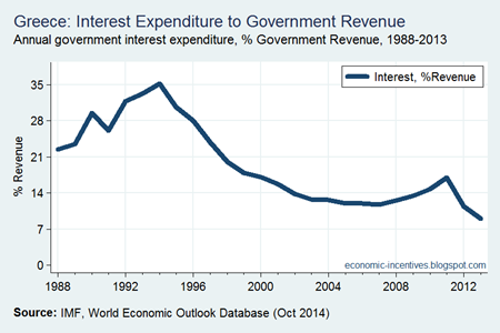
    A similar pattern emerges if we look at interest expenditure as a percentage of government revenue.

    Greek Interest to Revenue

    Since 1998, public interest expenditure has been equivalent to 19 per cent, on average, of government revenue; in 2013 it was 9 per cent.

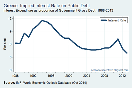
    So there is a bit of a contradiction – although the stock of Greek debt has never been higher, debt servicing costs have never been lower (at least since 1988).  This is because the average interest rate on Greek government debt is lower than at any time since 1988.

    Greek Interest Rate

    In the past quarter of a century the implied interest rate on Greek government debt has averaged 7 per cent, in 2013 it was 2.25 per cent.

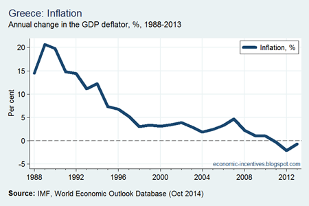
    Greece has had much higher debt servicing costs in the past and the way out of these was through high inflation.  When debt servicing costs were heading over 10 per cent of GDP in the late 1980s, inflation was 15 per cent and sometimes more.

    Greek Inflation

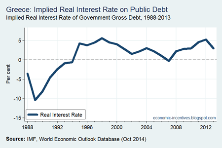
    If we use these interest and inflation rates we can see that in the late 1980s and early 1990s the real interest was negative.  It is positive now but not unusually so.
    Greek Real Interest Rate

    One refrain heard is that the primary surpluses (the government balance before interest expenditure) required to bring Greece’s government debt ratio down are not feasible, at least politically.  History would suggest that this is not the case.

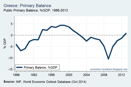
    During the 1990s Greece made efforts to achieve the Maastricht criteria for entry into EMU.  This meant a reduced reliance on inflation to stabilise the debt ratio.  But the Greek debt ratio was stable during the 1990s.  It might have been close to 100 per cent of GDP but it wasn’t increasing.  This wasn’t because the inflation rate exceeded the interest rate (from 1994 to 1999 the real interest rate averaged 3.6 per cent).  The reason the debt ratio didn’t increase was because sufficiently large primary surpluses were run.

    Greek Primary Balance

    From 1994 to 1999 primary surplus averaging 3.4 per cent of GDP were achieved by Greece.  This story of what happened then is now well known.  Greece used Goldman Sachs to manipulate its government accounts which facilitated the erosion of the primary surpluses achieved during the 1990s without triggering (too many) alarm bells under the Stability and Growth Pact.

    However, the point is simply that Greece moved to stabilise the debt ratio in the 1990s when debt servicing costs were far higher than they are now.  This was achieved using large enough primary surpluses – and maintained, at least a while.   Correlation is not causation but here is the real growth rate overlaid on the primary balances.

    Greek Primary Balance and Growth

    The 3 per cent of GDP primary balances of the 1990s were accompanied with real GDP growth rates of the same magnitudes.  As we know this did not continue in the 2000s and by 2003 a primary deficit had returned and these averaged around 2 per cent GDP up to 2008 (the overall deficit average nearly 7 per cent of GDP).  Imbalances built up and when measures were introduced to try and correct the deficit the Greek economy went into a nosedive.

    Will a debt write down solve Greece’s problems? No. Debt servicing costs have never been lower.  If debt write down led to economic growth Greek should be first in class as it has a €107 billion debt write down (PSI) in 2012.  The focus needs to be on the flows; not the stocks.  And on this Syriza are correct.

    What use is a proposal to reduce Greek debt to 50 per cent of GDP if Greece has to pay 5 per cent interest on the remaining debt.  That would give an interest bill greater than it pays now.  The debt ratio of 175 per cent of GDP is not the source of Greece’s problems (and with differing interest rates and maturities comparing countries with the debt ratio is little more than a blunt interest).

    Yes, Greece does need a further reduction in its net debt interest costs.  There is still some scope for this.  And a reduction in the target for the primary surplus.  1.5 per cent of GDP is probably too low but 2.5 per cent might work.  The wonks can get out their calculators, spreadsheets and acronyms to engineer a further reduction in the net interest cost of the Greece’s debt but there is no outside help that can bring about the primary surplus.  And this is where Syriza face their greatest challenges.

    Reaching an agreement on Greek debt is achievable.  This will cost the creditor countries but has to be done.  Ireland can reduce the interest rate on the €347 million loan provided to Greece in 2010.  The fact that it needs calculators and spreadsheets means it is difficult to communicate.  This is good in the creditor countries where some people don’t want to pay for Greek profligacy, but bad in Greece because explaining the benefits is a hard sell.

    The most important thing, aside from lower interest rates, is to actually provide the money on lengthy terms.  The removal of debt rollover fears will provide some much needed certainty.  Whatever about a cold analysis of interest rates it is the animal spirits of individual decision-making that matters.  The Greek people need to be assured that they are contributing to an economy that will be in place for the long term.  I’d imagine there has been a lot taken out of the economy over the past few years; that needs to be reversed.

    The 175 per cent of GDP debt gives a focal point for all the attention on Greece, but in a sense it is misdirected.  The focus needs to be on the flows.  The EU can help with one (interest) and possibly the ECB with another factor (a bit of inflation) but it is the the rest that must be fixed (taxes, spending, consumption, investment, exports……).

    Wednesday, February 4, 2015

    The (slow) improvement in the Public Finances

    Figures from the Exchequer Statements show that the Exchequer Balance has improved in each of the past four years.

    Exchequer Balance 2011-2014

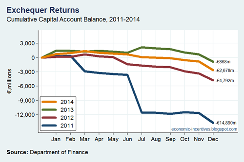
    However, for the years to 2013 this was because of improvements in “one-off” items in the capital account: large recapitalisation payments in 2011 moving to some (much smaller) asset sale receipts in 2013.

    Capital Account Balance

    Last year, however, marked the first year where there was a clear improvement in the current account.  These are the regular and ongoing receipts and expenditures from the Exchequer Account.

    Current Account Balance 2011-2014

    We will have to move to a current account surplus but there was little or no progress on that until 2014.  And most of this was achieved through higher tax revenues.

    Tax Revenues 2011-2014

    Since 2011, tax revenues have increased by around €7 billion.  Over the same period the Exchequer Current Deficit has improved by €6 billion. There is still a bit to go (and early indications that the improvement has continued in 2015).

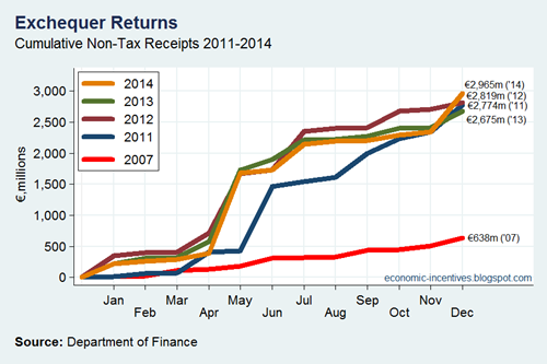
    It should be noted that the Exchequer Account has become much more dependent on Non-Tax Revenue in the Current Account.

    Non-Tax Revenue2

    The composition of non-tax revenue is looked at here but it can be seen that it is now more than €2 billion greater than the pre-crisis levels seen in 2007.  A lot of this is down to banking support measures (central bank surplus, contingent notes interest, guarantee fees) and cannot be expected to last indefinitely.  These revenues will have to be replaced.

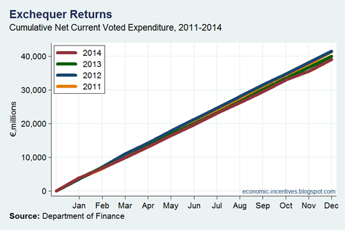
    On the expenditure side, here’s a chart of net voted current expenditure.

    Net Voted Current Expenditure

    On aggregate there doesn’t appear to be a lot happening there but voted current expenditure has been reduced from €41.4 billion in 2011 to €39.0 billion in 2014.

    Offsetting this there have been increase in non-voted current expenditure – the main component of which is servicing the national debt. 

    Debt Interest

    Debt interest expenditure rose rapidly in the years to 2013.  There was only a small rise in 2014 and the continuing low-interest environment allowing the refinancing of some debt at lower rates (such as the IMF loans) means that it is likely that debt interest expenditure will fall (but not by much) over the next few years.

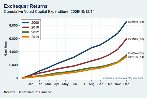
    By far the greatest change in the Exchequer Account during the crisis has been the huge scaling back of voted capital expenditure.  Since its peak in 2008 voted capital expenditure has been cut by more than 60 per cent.

    Voted Capital Expenditure

    Printfriendly