Friday, September 25, 2015

Why is it so hard to present inequality statistics?

In today’s Irish Independent Cormac Staunton has a piece that responds to a piece yesterday by Dan O’Brien which in turn was a reply to a documentary by David McWilliams shown by RTE on Monday night.  The print articles discuss data on inequality.  One would think that given these are discussions of research carried out by other organisations it would be fairly easy to reach an agreement on what the numbers are.  This is not so.

Staunton’s piece runs under the headline that “There's no denying inequality's a growing problem in Ireland - and everywhere else”.  On wealth inequality is begins by saying:

It [the documentary] showed that people believe that the top 20pc in Ireland have more than 60pc of all wealth.

In fact, they have 72pc of all wealth - that's one in five people owning almost three quarters of the value of all the land, housing and financial assets in the State.

That is not what wealth distribution figures measure.  Wealth distribution figures do not show who owns the assets.  It is a net wealth figure.  If a person owns €10 million of assets they obviously have lots of assets. But if they also have €10 million of liabilities their net wealth is zero.  This person will be towards the bottom of the wealth distribution even though they own lots of assets.

Examples such as this are extreme and there is likely a high correlation between net wealth and ownership of assets but it is not correct to say they are the same as one includes the impact of liabilities and one doesn’t.

Next Staunton says:

The programme showed how growing inequality in Ireland was part of a global phenomenon which is causing great concern amongst economists and leaders across the political spectrum.

Except the documentary showed no evidence of growing inequality [unless you count flashy cars being shown on the screen, the fact that food on private jets is nice and that there’s a fella in London who sells expensive watches.]

On data sources Staunton says:

The programme also cited Credit Suisse data showing how the 'middle 60pc' in Ireland had 30pc of all wealth, which is less than that held by the top 5pc. Again, the CSO data shows similar results.

Haggling over data and sources, or judging the level of inequality only in relation to other countries, ignores the bigger picture.

So lets look at the Credit Suisse data.  Here are the net wealth shares going to the top 10 per cent of the wealth distribution.

Wealth Shares by Country

According to the Credit Suisse data the net wealth held by the top decile was 58.2 per cent in 2000 and was 58.5 per cent in 2014.  There is no evidence there of growing inequality in the share of net wealth held by those at the top of the distribution.  If people use the 2014 figures to talk about the level of inequality now and then talk about increasing inequality why don’t they use the earlier figures to show how inequality has changed?

Research from the Central Bank has estimated a gini coefficient for net wealth in Ireland since 2006.

Wealth Gini

Staunton though is adamant that inequality is increasing:

The simple fact is that inequality of wealth and income has been growing in every country in the developed world over the last 30 years.

It would be helpful is there was a reference to evidence that supports this.  Inequality is growing in lots of countries but not all of them.  From above we have evidence that wealth inequality is not growing in Ireland (or at least is not growing since 2000 in the Credit Suisse data). 

We do know that income inequality is bad for the economy and we can agree on the following:

But inequality is also bad news for the economy. Studies from the IMF and others have shown that higher inequality can negatively affect the economy because the wealthy spend less of their incomes than middle- and lower-income groups.

This is true.  Here is a study from the OECD on this topic called “Trends in Income Inequality and its Impact on Economic Growth”. Paragraph 25 and Figure 3 on page 18 are where we need to turn.  The section concludes [emphasis added]:

Rising inequality is estimated to have knocked more than 10 percentage points off growth in Mexico and New Zealand. In the United States, the United Kingdom, Sweden, Finland and Norway, the growth rate would have been more than one fifth higher had income disparities not widened. On the other hand, greater equality helped increase GDP per capita in Spain, France and Ireland prior to the crisis.

For a start the research shows that income inequality has not been increasing in every country in the developed world.  There are three countries where inequality has fallen and this “greater equality helped increase GDP per capita”. And, yes, Ireland is one of those three. 

The fine print is in the paper but that seems like an important point for Ireland when citing studies that show the negative link between inequality and per capita GDP.  Falling inequality in Ireland helped increase GDP per capita. 

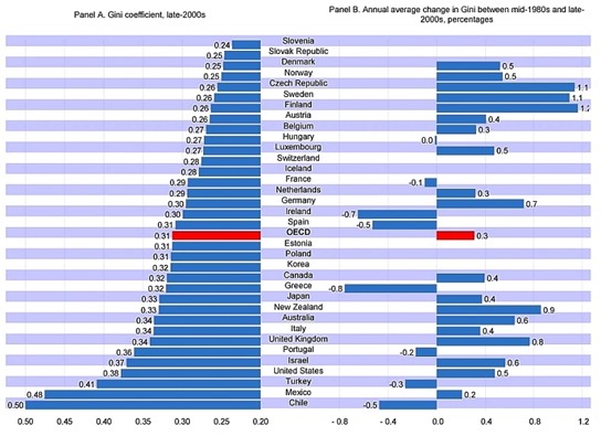
Here is a chart using OECD data on gini coefficients (click to enlarge).

gini-coefficient-change-oecd

Across the OECD inequality has been increasing on average by 0.3 per cent per annum.  In Ireland it has been falling by 0.7 per cent per annum. 

Most of the countries above Ireland have been showing increasing inequality with some of the largest increases in inequality seen in Sweden and Finland.  If this positive trend for Ireland continues our ranking should continue to improve.

We do have major issues with inequality (market income distribution and joblessness in households for income, and debt and negative equity among a certain cohort for wealth) but an inability among those discussing it to agree on the facts can only hinder rather than encourage progress. 

Can we not agree that Ireland is not unusually unequal when it comes to disposable income or net wealth and that neither of these are showing an upward trend?  And turf out the absolute statements about inequality increasing everywhere. It would be a helpful starting point.

Wednesday, September 23, 2015

Age and the Distribution of Wealth

One important feature of the distribution of wealth is its relationship with age.  There are many determinants of wealth inequality but one of the most important is age.  If we divide the population by age quintiles then we see that the youngest households have ten times less wealth than the oldest households.

These tables are taken from a recent CSO release.

Wealth Shares

Households where the reference person is under 35 make up 20.1 per cent of the sample.  These households have a 3.5 per cent share of net wealth.

Households where the reference person is 65 and over make up 20.1 per cent of the sample.  These household have a 32.5 per cent share of net wealth.

If we look at median net wealth we see that the gap is even more alarming.  The median wealth of the under 35 households is €4,000.  The median wealth for the over 65 households is €202,400.  The middle household in the under 35 age bracket has 50 times less wealth than the middle household in the over 65 households.  Do we want to make this gap smaller? If we want to do that how do we achieve it? Take wealth from the nearly retired and give it to the newly qualified? Would it not be better if this gap was even greater?

Of course, the substantially higher mean net wealth compared to the median for each age category show that within the age cohorts wealth is not evenly distributed.  The point is that a key driver of overall wealth inequality is age.  People’s wealth levels are different because they are at different points of the life cycle.

This is wealth inequality we should probably have more of not less.  Most young households will start off with close to zero net wealth and over their working lives we would like them to repay a mortgage if they have one, build up some savings or grow an investment fund for their retirement.  More of this age-related wealth inequality would be good.

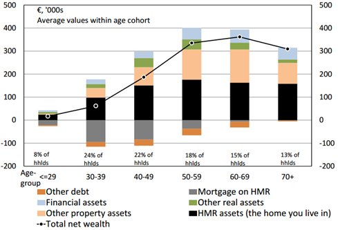
This chart from research by the Central Bank on this data shows the evolution of assets and liabilities by age.

Wealth by Age

We can see that households tend to buy houses in their 30s and 40s (the positive black bars that increase in size) and then repay the mortgage debt over the next 20 years (the negative grey bars that decrease). 

Investment in other property assets (the skin coloured section in the middle of the bars) increases when people are in their 40s and 50s with financial assets (the light blue at the top of the bars) making a small contribution to the increase in wealth by age.  By the time households reach their 70s debt levels are very low and they begin to sell assets (mainly other property assets).

Again though these are average values so do not tell us much about the distribution within each age category.  If we do have problems with wealth inequality it would be helpful to look at the distribution within age categories rather than across the entire population.  We should have more wealth inequality by age not less.

Sunday, September 13, 2015

Ireland’s Recession/Recovery versus the EU15

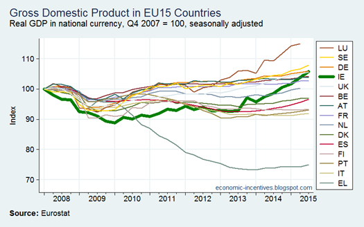
The rise in Ireland’s GDP over the past two years has been remarkable. 

EU GDP

If we take the last quarter of 2007 as the pre-crisis starting point we see that Ireland was the worst performer in terms of GDP up to the middle of 2010 but we only had Greece through to the end of 2011.

Since the middle of 2013 Ireland’s GDP has risen rapidly and now ranks fourth in the EU15 overall performance over the past eight years with only Luxembourg (outlier?), Sweden and Germany (barely) showing better economic growth over the period.

If we just focus on the domestic components of GDP the following picture emerges.

EU Domestic Demand

This indicates that it is net exports have contributed significantly to Ireland’s high ranking in the initial GDP chart.  For domestic demand Ireland ranks 10th in the 2008-2015 period and the upward trajectory suggests that this will rise but it can be seen that the pre-crisis level of domestic demand in Q4 2007 still has not been reached.

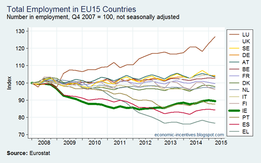
The ranking for employment is even lower at 12th with Ireland only doing better than Portugal, Spain and Greece while there is a large gap to be closed before Ireland can overtake any of the countries ahead of us.

EU Employment

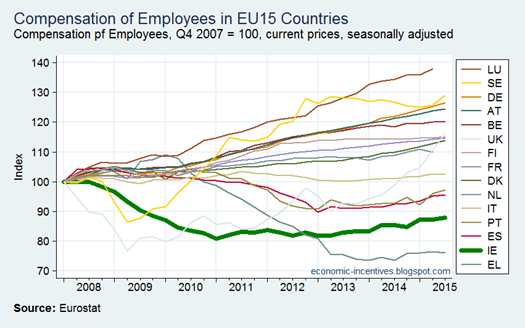
When it comes to compensation of employees Ireland is second last (though the data here is nominal rather than real).

EU Compensation of Employees

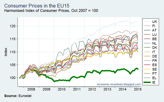
One caveat to the above is that it in nominal data and a look at the inflation data from the HICP shows that Ireland is a bit of an outlier.

EU Inflation

The gap between the Ireland(bottom) and the UK (top) indices is pretty remarkable.

Thursday, September 10, 2015

Contract Manufacturing in the QNAs

There is a lot going on in Ireland’s national accounts.  Here we will just try to isolate a few trends that allow us to see the impact “contract manufacturing” is having on the figures.  As before the conclusion is that the impact on some individual series in the accounts is large but that the growth effect is probably small.

First up, here’s the trade components of GDP which are threatening to go off the chart.

Trade Components of GDP

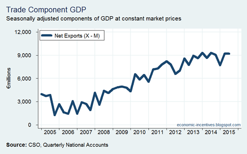
The first indication that this is having a limited growth effect is that it is both exports and imports that are rocketing so the balance of trade is largely unaffected.

Balance of Trade

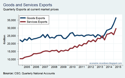
But let’s go through it in a bit more detail. First if we divide the trade figures into goods and services.  With exports we can clearly see that the recent surge has occurred in goods.

Exports

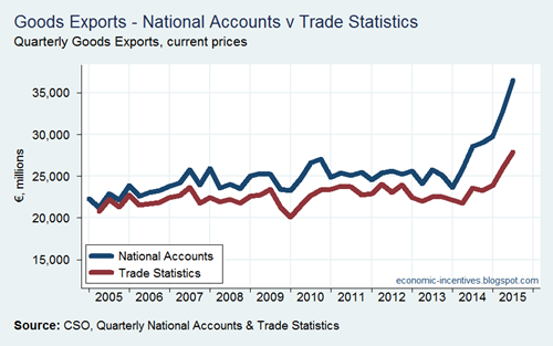
And we know that these goods do not physically leave Ireland in the state recorded in the national accounts because of the massive gap that has emerged between the goods exports figures in the Quarterly National Accounts and the Trade Statistics datasets. 

Exports QNA v TS

The Trade Statistics do show goods exports increasing but such has been the increase over the past 18 months in goods exports using national accounts methodology that the gap between the two series was €8.5 billion in Q2 2015.

The goods may have left Ireland in an unprocessed state but there was additional processing done in another country that added to the value of the goods.  Much of this added value is booked in Ireland as some elements of the risks, functions and assets behind that added value are located here.  The party that does the manufacturing gets paid a fee for undertaking the activity (so their national accounts show a service export) but the sale of the goods is recorded in Ireland’s national accounts.

There might be lots of money coming into Ireland from these sales (even though the goods don’t originate from here) but we can also see money flowing out.  Here is the breakdown of imports.

Imports

If goods exports have been shooting up in the national accounts we can see that services imports have been showing a similar rise on the other side.  A small amount of this is probably the fees the companies are paying to the entities carrying out the contract manufacturing.  Far more of it is likely to be patent royalties associated with the goods being made – the huge increase in this ‘contract manufacturing’ activity has happened in the pharmaceutical sector.  This can be seen in the Industrial Production statistics published by the CSO which includes contracted manufacturing.

Anyway what we have is large inflows to Ireland from the sale of these goods and large outflows from Ireland to where ever the patents of these products are held.  This means that the balance of trade in goods is showing remarkable growth while there is an offsetting decline in the balance of trade in services.

Balance of Trades

What is the net impact after accounting for this offsetting effects? Difficult to say.  In an earlier note the CSO did say that ‘contract manufacturing’ was “not particularly significant in explaining the recent growth in Irish GDP” when discussing the 2014 figures.

It might not be driving growth but it must be having some effect.  And as we noted before someone is paying a lot of Corporation Tax.  For the first eight months of the year Corporation Tax revenues are 40 per cent ahead of where they were profiled to be with some €900 million extra collected in the year to date.  The information note from the Department of Finance released with the August Exchequer Statement says that this “over-performance in the year to date primarily relates to improved trading.”  I don’t know whether trading has improved but it certainly has increased – an mainly intra-company trading at that.

It could also be that we are the beneficiaries of some pre-BEPS jitters.  Companies could be amending their structures in advance of BEPS measures such as country-by-country reporting.  This will require companies to provide revenue authorities that they owe corporate income tax to with the positions in the other countries in which they operate.  It could be that companies are moving to report more of their activities/profits in Ireland rather than in some other jurisdictions (actual tax havens perhaps) to try and avoid drawing the ire of other tax authorities that they report to.  Just some supposition mind!

Q2 National Accounts in Charts

Here’s a slidedeck I used earlier for a presentation on today’s Quarterly National Accounts release from the CSO.

The .ppt can be downloaded by following the link above – which shows that I do label the vertical axes rather than the corrupted version that Slideshare shows which omits them for some reason.

Printfriendly