Showing posts with label QNHS. Show all posts

Friday, February 9, 2018

Some snapshots of labour markets in the EU15

Here are some snapshots of conditions in the labour markets of the EU15.  They are offered without commentary.

  • Self employed with no paid employees
  • Temporary employees
  • Temporary agency workers
  • Shift workers
  • Underemployed part-time workers
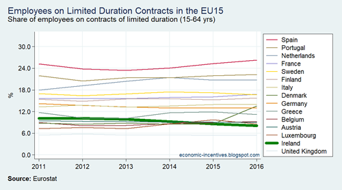
  • Contracts of limited duration
  • Precarious employment rate
  • Employed persons with a second job
  • People working 49 hours or more per week
  • Employees at-risk-of-poverty

EU15 LFS Self Employed with No Paid Employees

EU15 LFS Temporary Employees

EU15 LFS Temporary Agency Workers

EU15 LFS Shift Workers

EU15 LFS Part-time Underemployed

EU15 LFS Contracts of Limited Duration

EU15 LFS Precarious Employment Rate

EU15 LFS Second Job

EU15 LFS Long Working Hours

EU15 SILC Employees AROP 2009-2016

Wednesday, August 26, 2015

Recovery in employment continues

The Quarterly National Household Survey (QNHS) has assumed a greater role in providing information about the performance of the economy in recent years.  This is not because of any improvements in the QNHS (indeed the results of Census 2011 show that caution to some of the QNHS estimates must be exercised) but because of difficulties in untangling all the caveats associated with Ireland’s national accounts data.

Employment Total

After slowing down through most of 2014 it now appears that employment growth re-accelerated in the first half of 2015.

Employment Growth

If we do a simple arithmetic projection of employment excluding the construction sector then the pre-crisis peak of employment (excluding construction) would be regained by the middle of next year.

Employment ex Construction

Almost all of the recent employment growth is in full-time rather than part-time employment.

Full Time and Part Time Employment

Though amongst part-time employees it should be noted that the drop in those who consider themselves to be “underemployed” has not continued into 2015.

Part-time underemployed

This is also reflected in the broad unemployment rate which includes potential labour supply (those marginally attached to the labour force and those who are willing to work more).  Note both unemployment rates here are not seasonally adjusted.

Unemployment Rates

Recent employment growth has mainly been in employees rather than in the self-employed.

Employee and Self Employed

And among employees there has been a drop in public sector employee numbers and a rise in private sector employees. Again these series are not seasonally adjusted.

Pub and Priv Employee Numbers

It can be seen that employee numbers in the private sector have been growing since early 2011.  Overall employment did not grow in 2011 as there were falls in self and public sector employment but private sector employee numbers have been growing for four years.

The regional data show that the employment growth is not Dublin-centric.  Over the past 12 months there was a 41,900 increase in employment outside Dublin compared to 15,400 in Dublin.  In growth terms Dublin had only the sixth fastest increase in annual employment of the eight regions.

Regional Employment

Saturday, January 31, 2015

Who’s back at work?

We know that employment is increasing.  The rate accelerated briefly in early 2013 before falling back but the level increased again in the second and third quarters of 2014.  From the trough in 2012 Q1 total employment had increased by a just over 100,000 to 2014 Q3 (without seasonal adjusting).

On a more like-for-like basis total employment between Q3 2012 and Q3 2014 has risen 85,600.  The annual increase was 58,000 in Q3 2013 though this had reduced to 27,600 in Q3 2014.

Using the Quarterly National Household Survey (QNHS) we will go under the hood to see where this increase 85,600 increases has arisen in the two years to q3 2014. 

Total employment

We will look at the following at the following breakdowns:

  • Gender
  • Full-time versus Part-time
  • Employee and Self-Employed
  • Region
  • Age
  • Nationality
  • Education
  • Hours Worked
  • Full-Time Equivalents
  • Aggregate Wages

The CSO also provide breakdowns by economic sector and occupational groups but these were distorted by the incorrect treatment of workers in the agriculture sector that was revealed by Census 2011 so are omitted here.

Wednesday, December 3, 2014

Unemployment rate falls below 30-year average

The CSO have data on the ‘seasonally adjusted standardised unemployment rate’ back to January 1983.  The rate is currently benchmarked to the QNHS and monthly updates are provided using the Live Register.  With today’s Live Register data the CSO estimate the rate to be 10.7 per cent. 

The average from 1983 to today is 10.9 per cent.  The current 10.7 per cent is the first time the rate has been below the average since February 2009 (when the rate of 10.2 per cent was below the then average of 10.4 per cent)

Rate

The horizontal red line is the average using all data from 1983 to the present time; the green line is a moving average using the data from 1983 to each month; and the orange line is a 10-year moving average for each period.

Tuesday, March 18, 2014

SMEs and 70 per cent of employment

The relative importance of SMEs to the Irish economy has been touched on during the recent discussion of SME debt.  Sometimes it is stated that SMEs provide 70 percent on employment.  That is not quiet true.  Something along the lines of 70 per cent of people engaged (employee or proprietor) by private sector enterprises are with SMEs is better but it can be seen that this excludes all public sector workers and the self employed.

The 70 per cent figures comes from the CSO’s Business in Ireland 2011 survey which opens chapter one starts with “Six Key Findings from Business in Ireland 2011” of which the first is (emphasis added):

1. Key statistics on small and medium enterprises (SMEs)
In 2011, SMEs (employing less than 250 persons) accounted for 99.8% of active enterprises, 68.6% of persons engaged, 50.1% of turnover and 46.0% of gross value added (GVA). GVA is the gross income from operating activities and is the balance available to enterprises to pay employees and realise a return on investment. It is noticeable that while SMEs employed almost seven in every ten persons in the business economy, they accounted for less than half of GVA.

The seven in ten statistic clear refers to “the business economy”.  As stated this excludes public sector employees and the self-employed.

There are around 1.9 million people working in Ireland.  They can roughly be broken down as:

  • 800,000 in c. 180,000 SMEs (with < 250 employees)
    • 320,000 in c.170,000 micro enterprises (< 10 employees)
    • 260,000 in c.15,000 small enterprises (11 to 49 employees)
    • 220,000 in c.2,500 medium enterprises (50 to 249 employees)
  • 400,000 in c. 500 large enterprises (with > 250 employees)
  • 350,000 in the public sector (excluding semi states)
  • 350,000 self-employed (with and without paid employees)

SMEs count for around 42 per cent of employment in Ireland.  SMEs are the largest source of employment but not 70 per cent of it.

Monday, March 3, 2014

Employment as a Leading Indicator

The labour market results from the Quarterly National Household Survey continue to be impressively positive.  There is no doubt that this is a good thing, but the overall impact of the improvements remains uncertain.  The employment gains are not be reflected in other data series: household disposable income, exchequer income tax returns, core retail sales etc. 

In the standard discussion of recessions it is put forward that improvements in unemployment/employment lag behind a general upturn in the economy by two or more quarters.  Ireland seems to be an unusual case where we are seeing employment improvements first.

The annual change in the number of people employed paints a very positive picture in recent quarters.

Annual Change in Employment

In percentage terms, employment is growing at close to rates, which unsurprisingly, have not been seen since 2006 and 2007.  But overall conditions are not like they were then.  Here are the annual percentage changes in total employment and aggregate wages received by households.

Wages and Employment

Employment growth has been positive in annual terms for more than a year.  Growth in aggregate (nominal) wages remains absent, though the series only goes as far as Q3 2013 and recent data are subject to revision.

The pattern of household disposable income reflects the above changes in wages received.  Here is the level of household disposable income for the past eight years.  The point of note here is the absence of any notable upturn in 2013 (during which employment was growing).

Household Disposable Income

Of course, even if aggregate wages were increasing the impact on disposable income would be offset by certain tax increases.  However, if we are looking for labour market improvements it might be useful to just look at income tax.  Cumulative income tax by month does not show any improvement in 2013 relative to 2012.

Cumulative Income Tax 2012-13

Finally, core retail sales could be used a positive affirmation of the labour market statistics.  It is not much but a pattern of rising core retail sales since the spring of 2013 is discernible.

Retail Sales to Jan 14

However, the increase is driven by volume (+2.7 per cent in the year to January) as opposed to value (+0.9 per cent on the year).  We might be buying more but we are not really spending more (the motor trades excepted).

Of course, a drag on household spending continues to be the debt overhang that many households are carrying.  The household sector continues to deleverage relatively rapidly.

Household Loans

Since peaking at nearly €204 billion at the end of 2008 the total loan liabilities had declined to €168 billion by the third quarter of 2013.

It would be useful to dig further into the QNHS figures but some re-classification problems mean that many of the sub-trend categories cannot be interpreted as actual changes.  The CSO highlight this in relation to employment in the Agriculture, Food and Forestry sector (+26,800 but due more to statistical reclassifications than increased activity).  This also has knock-on consequences for divisions into categories such as employee or self-employed, the patterns of which could be useful for explaining the wage, income and tax trends shown above.

So we are left with a position where labour market statistics are very positive – total employment up 3.3 per cent to the end of 2013 – but this is not reflected elsewhere.  In nominal terms aggregate wages, income tax revenues, disposable income and consumption expenditure are all not doing much better than remaining static.

The increases in employment are undoubtedly positive but it is unusual that they are leading wage, income and consumption increases.  It is not clear where these aggregates are currently heading but if the employment increases continue they will also start to rise.  Surely?

Thursday, September 26, 2013

Employment patterns – numbers employed and new FTE data

There has been some talk recently of an improvement in labour market conditions.  This narrative has support from patterns such as this from the Quarterly National Household Survey.

Total Numbers Employed SA

In the year to Q2 2013 employment is up around 33,000 and speculation of a turn in the labour market is not outlandish.  There have, however, been concerns raised about this improvement because of a caveat the CSO put with the figures in relation to the Agriculture, Forestry and Fisheries sector.  The last few QNHS releases from the CSO have said:

In the case of the Agriculture, forestry and fishing sector it can be noted that estimates of employment in this sector have shown to be sensitive to sample changes over time. Given the continued introduction of the sample based on the 2011 Census of Population as outlined in the note on the front page of this release, particular caution is warranted in the interpretation of the trend in this sector at this time.

This is the trend.

Agriculture Numbers Employed SA

Employment in this sector is recorded as being up around 16,000 in the year, equivalent to half the overall increase.  So is the increases in employment merely the reflection of a measurement issue in the CSO data? No.

The CSO note tells us that caution is only warranted for the “trend in this sector”; they do not suggest such caution carries through to the overall figures.  This is a result of a way the figures are compiled.  The sectoral data from Agriculture and other areas do not contribute to the calculation of the total employment figure – they are a distribution of it. 

The CSO determine the total number employed and then divide that across the different NACE categories.  The number of employees allocated to the Agriculture sector is under question at the moment, the figure provided for the total number of employees is not.  But the 33,000 increase in employment does warrant further scrutiny.

The breakdown between full-time and part-time employment is important.  Here are the seasonally adjusted full-time figures.

Full Time Employment SA

Full-time employment is up about 22,000 on the year so accounts for around two-thirds of the increase.  By definition, part-time employment provided the remaining increase in employment.

Part Time Employment SA

Apart from the 12,000 increase in part-time employment in the past year, the other noticeable thing is that part-time employment shows a consistent upward trend since 2008, even as full-time employment was falling rapidly.  One concern with part-time employment is that it may include people who would prefer to be in full-time employment and there are “under-employed”.

The CSO provide data on such a measure although only back to Q3 2008 and also not on a seasonally adjusted basis.

Part Time Employed Underemployed

This has also been steadily increasing, though over the past 12 month is actually down around 7,000.

One big issue with looking at changes in the number of people in employment is that it might fully reflect changes in the amount of employment people are actually engaged in.  Existing employees could be getting more (or less) hours which reflects a change in labour market conditions not reflected in the numbers employed data looked at above.

To little reaction the CSO have put together a complementary data from the QNHS that provides labour market data in full-time equivalents.  In the CSO’s own words:

The FTE employment measure for a respondent is the total actual hours worked by the respondent, divided by the average number of hours worked by respondents working in similar (gender, industry sector and employment status) full-time jobs.  While changes in the number of persons employed will typically be the primary driver of changes in FTE employment, it will also be affected by other factors.  These include increases or decreases in the proportion of total employment accounted for by part-time employment, the number of hours worked by people in employment and other changes.

FTEs give a measure of the amount of work as opposed to the number working.

FTEs

The amount of work has increased and there are around 30,000 more FTEs in employment now than a year ago, though all of that increase is down to the jump in the last quarter for which data are available, Q2 2013.

Using the new FTE data we can compare the reduction in the numbers employed since the peak to the reduction in the amount of work (the FTEs).

Total and FTE Index

It is clear that the loss of work has been greater than the reduction in the numbers employed.  There are people in jobs but they are working less than their equivalents did before.  This reflects the increase in part-time employment.  Numbers employed are down 14% from the peak in 2007, while FTEs are down 17% over the same time. 

As outlined earlier both measures have turned positive in the most recent data but it will take something similar over subsequent releases before we can see that a trend has become embedded.

Thursday, May 30, 2013

Divergent trends in employee numbers

Yesterday the CSO published their latest update of the Earnings and Labour Costs Survey.  Using complementary results from the Quarterly National Household Survey the CSO provide some details of employee numbers by sector.

The figures exclude the Agriculture, forestry and fishing sector and  by definition excludes all people classified as self-employed.  The figures are number of employees rather than people at work so a person with two jobs would be counted twice.

The pattern for total employees presents a familiar pattern.  There was rapid decline in 2008 and 2009 which moderated in 2010 and the total has been going nowhere since the beginning of 2011.

Total Employees

However, if we get a public/private decomposition of the total since the levelling off at the start of 2011 then a slightly divergent picture emerges. 

Public and Private Employees

Although the total has remained around the same the number of public sector employees has fallen from 409,000 to 384,000 while the number of private sector employees has increased from 1,107,000 to 1,144,000.  The fall in private sector employees has been offset by the rise in private sector employees.

The public sector includes civil servants, public servants, contract and agency staff with public bodies and employees of commercial and non-commercial semi-state bodies.  The figures are done on a headcount rather than full-time equivalent basis and peaked at 427,000 at the end of 2008.

The figure indicate that there has been a rise of around 35,000 in the number of private sector employees over the past three years.  It would be ideal if a further breakdown of full-time/part-time was provided for the public and private sectors.  The QNHS does provide figures for full-time/part-time employment but it does not provide a public/private sector breakdown (and also includes the self-employed as well as employees). 

A quick glance at the most recent QNHS release (Table 1a) shows the total number of people in employment (employees and self-employed) remaining relatively steady over the past two years but that a fall in full-time employment has been offset by a rise in part-time employment.  Given the partially overlapping and partially different coverage of the series it is difficult to establish exactly what is going on.  It could be that there is a reduction in full-time employment in the public sector and an increase in part-time employment in the private sector.  The figures from the CSO do not fully confirm this though.

We can say that the number of employees has been increasing in the private sector.  We can also see that the number of employees in the public sector has been decreasing.  The rise in the private sector is negligible compared to the fall that came before it but it is a small move in the right direction nonetheless.

Thursday, May 9, 2013

Misinterpreting youth unemployment rates

Unemployment rates in the EU27 and EA17 have rightfully being front and centre.  They are unacceptably high.  One sub-category that gets considerable attention is the “Youth Unemployment Rate” for those aged 16 to 24 but it is also one that is subject to significant misinterpretation.  Here is President Higgins at a conference in Trinity College back in January as reported by The Irish Times:

“As President of a country that is a member of the European Union I am so conscious of the discourse that concentrates entirely on the security of the currency, but is happy to leave aside the question of an enormous wedge of the population that are unemployed – 55 per cent of people between 18 and 24 in some countries.”

Some youth unemployment rates are as high as 55% but that does not mean that 55% of people in this group are unemployed.  Unemployment rates are calculated as a percentage of the labour force; not the total population.

Here are the youth unemployment rates in the EU at the end of 2012.

Youth Unemployment Rate

At 27%, Ireland is among the worst performers and the over-50% rates of Spain and Greece are clearly evident.

There are 5.6 million people in the EU27 aged between 16 and 24 who are unemployed leading to the youth unemployment rate of 23%.  Per comments like those from President Higgins this would be interpreted as meaning that almost 1-in-4 people in this age group are unemployed.  Not so. There are 56.7 million people aged between 16 and 24 in the EU.

The youth unemployment rate as a percentage of the total number of people in the age group is 10%.  This is unacceptably high but a rate of 1-in-10 is significantly different to a rate of 1-in-4.  The reason for the difference, of course, is that a huge proportion of young people are not in the labour force – they are in education or training.  In Ireland the proportion of people aged between 16 and 24 who are unemployed is 11%, compared to the unemployment rate of 27%..

Here is a chart that gives the number of 16 to 24 years old who are unemployed as a percentage of the labour force and as a percentage of the population.

Youth Unemployment Rate

It is still an ugly picture with rates for the population measure ranging from 3.8% in Germany to 20.5% in Spain.

Friday, July 1, 2011

100,000 More People and our Economic Indicators

Yesterday’s preliminary Census 2011 results have suggested that the population is 100,000 larger than previously estimated.  We now have an extra céad míle daoine to be giving out the céad míle fáilte.

At first glance this would just appear to be more of a demographic than economic issue, and not one that is related to the banking, public debt and unemployment crises we face.  However, the impact of this new population figure from the Census will not have been accounted for in the other statistics from the CSO which mainly come from surveys.

A survey like the QNHS which covers 20,000 might be very good at providing the breakdown and composition of the population in proportions but it struggles when estimating the overall size.  This is why the Census is undertaken rather than rely on a survey.

As a rough division we can break the population into three groups

  • 0 – 14 years
  • 15 – 64 years
  • 65 and over

Additions to the 0 to 14 group are likely to be mainly the result of births (though migration will also play a role).  Counting the number of births should not be a problem.  Without wanting to be morbid, exit from the 65 and over group will largely be via deaths which is again easily measurable and additions will generally come from natural aging rather than migration.  It would appear that the most difficult group to track, and the one where most of the extra 100,000 are likely to be found is in the 15 to 64 age group.

We don’t know anything about these 100,000 but we can draw some inferences based on the survey findings of the QNHS.  For simplicity we will assume that all of these 100,000 are in the 15 to 64 age group though this will clearly not be the case.  We will also assume that the characteristics of this group match the characteristics of the population as a whole, though again this may not be exactly the case.

The employment rate rate among those aged 15 to 64 is 58.9% so there could be around 60,000 more in employment than previously estimated.  This would be an increase of 3.3% on the current employment estimate of 1.8 million.

There are 456,000 people on the live register.  Of these 86,000 are casual or part-time workers so there are 370,000 people on the live register with no employment.  The CSO’s official measure of unemployment is 295,000, and when asked to self-assess there are 352,000 who classify themselves as unemployed. 

These are based on survey data from the QNHS so both could increase to closer reflect the number of unemployed from the Live Register.  It is unlikely that the revised population figure will change the estimated unemployment rate.  There has been a change in the size of the population rather than a change in the composition of it.

It is hard to know what impact this more accurate population figure will have on the National Accounts.  As in the labour market the CSO are more likely to get the rates correct rather than the absolute size.  These change to the population figure is unlikely to make significant changes to the dramatic negative growth rates we have experienced in recent years.  There could be some moderation of the drops in the past year of two but nothing huge.

What is more likely to change is the absolute levels and all GDP figures could be revised up without huge changes to the growth rates.  It is impossible to say how the CSO would go about this.  Nominal GDP in 2010 is now estimated to be €156 billion.  A 3.3% rise in that would bring it up to €161 billion.

The first revision of our 2010 GDP by the CSO saw our debt/GDP ratio fall from 96.2% to 94.9%.  If the revision here was applied then the 2010 debt/GDP ratio would be 91.9%.  We are still accumulating debt but maybe we are further away than we thought from the “terminal” level of 120% that many believe we are cascading inevitably towards.

The CSO will wait until official Census results are available but it will be interesting to see how the unearthing of these 100,000 people will play out in out economic statistics over the next few years.  This is largely a statistical exercise and does not change the hugely downbeat economic reality we face, but it will be more useful to have statistics that better reflect that reality than not.

Friday, June 17, 2011

Labour Market Status – the full-time employed

The QNHS may be beginning to signal that stabilisation in the labour market is not far away.  In a previous post we examined the principle economic status of individuals.  Here we focus on the group who classed themselves as ‘at work’ to determine how real this stabilisation is.

Here is a snapshot of the labour market status of the population aged over 15 since 2003.

Labour Market Status Status

Two things are immediately obvious from this graph.

  1. The increase in the population aged over 15 stopped in the middle of 2007.
  2. The fall in the number of people in full-time employment since the middle of 2007.

The reasons for the stalling of the population over 15 have been discussed elsewhere (it is largely the departure of non-Irish nationals).  Here we will look the numbers in employment.

Total Numbers Employed

Looking at the total number employed it suggests that labour market conditions are back to those last seen in early 2003.  Since the peak in 2007 the numbers employed in Ireland has fallen by 346,000.  The decline is continuing and two-thirds of the fall in the past year has been among non-Irish nationals who have subsequently left the country.  However, from the perspective of overall economic performance it doesn’t matter who they are and the 55,000 decline in employment in the past year is a continuing negative sign. We can also see the breakdown on the patterns on which is it likely the CSO’s seasonal adjustment methodology is based, the problems with which were noted here.

However, looking at the total numbers employed only gives a partial picture.  Next we consider the number of people in full time employment.

Full Time Employed

This is far worse than the total number employed and the decline is showing no signs of abating. Full-time employment is now back to levels last seen in 1999.  If this continues we will drop below the levels recorded at the start of the dataset in 1998.  When we examine the breakdown by gender we see that one group already are.

Full Time Employed by Gender

Male full-time employment is back to levels last seen in 1998.  Female full-time employment is declining and is back to 2004 levels.

Although the level of full-time employment has continued to head south, part-time employment has continued onward ever upward.

Part Time Employed

And these increases have been seen for both genders.

Part Time Employed by Gender

This reduction in full-time employment and increase in part-time employment gives rise to the following.

Proportion Full Time Employed

After hovering around 83% for nearly a decade the proportion of workers who are employed full-time has now declined to 76%.

The final graph of this set looks at the change in male employees and self-employed workers.

Male Employees

Since the middle of 2008 the number of male employees has fallen from 925,000 to 720,000, with a fall from 299,000 to 236,000 for male self-employed workers.  The equivalent fall for females employees is from 856,000 to 779,000 while the number of female self-employed workers fell from 63,000 to 57,000.  Male employment is down 268,000 with an 83,000 drop in female employment.

Principle Economic Status – Self Assessed

The QNHS is used as the primary measure of unemployment in Ireland.  We already saw that there may be some issues with the method used by the CSO to estimate the seasonally adjusted unemployment rate.  A second issue emerges when we consider the definitions of employment and unemployment used by the CSO.

In Employment: Persons who worked in the week before the survey for one hour or more for payment or profit, including work on the family farm or business and all persons who had a job but were not at work because of illness, holidays etc. in the week.

Unemployed: Persons who, in the week before the survey, were without work and available for work within the next two weeks, and had taken specific steps, in the preceding four weeks, to find work.

Working for one hour in the week prior to the survey means that the respondent is classified as employed.  The QNHS includes an additional question that asks people so self assess “their usual situation with regard to employment” and gives the following response categories:

  • At work
  • Unemployed
  • Student
  • Engaged on home duties
  • Retired
  • Other

Using this measure there are 352,000 people who classify themselves as unemployed which differs from the 295,000 people on which the 14.0% unemployment rate.  Here are the proportions of the above categories for the population aged over 15 since 2003.

Principle Economic Status

The changes may not be as pronounced as some might expect but the largest change since 2007 is obviously the drop in those at work and the rise in those unemployed.  Since Q4 2007 the proportion at work has fallen from 58.6% to 50.4%.  Most of this reduction has been picked up in the proportion unemployed which has risen from 3.5% to 10.0%.  The other categories are largely unchanged.

The 352,000 people who classify themselves as unemployed further belies the claims by many that there are 450,000 people unemployed in Ireland based erroneously on the numbers on the Live Register.  The Live Register is not an accurate measure of unemployment.  However, as we saw previously we could be closer to this 450,000 figure if many of those who have left employment had not also left the country (and in the majority of cases these were non-Irish nationals). 

Any claims that there are 450,000 unemployed are wrong.  The “official” figure is 295,000 and the “self-assessed” figure is 352,000.

If we use the sum of those who classify themselves as at work or unemployed as a measure of the labour force then the implied unemployment rate from this question in the QNHS is 16.1%.  The headline rate might be showing some improvement but that is not reflected in how respondents to the QNHS see their reality.

Number Unemployed by Gender

Nor is there any improvement when we look at those at work.

Number At Work by Gender

Using these measures it appears that the labour market is not getting any worse, but not getting worse is not the same as getting better.  Hopefully this stabilisation will convert to improvement over the coming quarters.

Adjusting Unemployment

Yesterday’s release of the the QNHS saw the headline rate of unemployment fall from 14.8% in Q4 2010 to 14.0% in Q1 2011.  This “improvement” must be examined in the light of the continued FALL in the numbers employed which fell from 1,823,200 to 1,804,200.  The unemployment rate fell but the numbers employed fell by nearly 20,000.

Another issue to consider is the fact that it is the seasonally adjusted rate which is usually given the most weight when assessing changes in unemployment.  However, over recent quarters this seasonally adjusted rate has exhibited a volatility which may not be reflective of actual outcomes in the labour market.  Here are the adjusted and unadjusted unemployment rates.

Unemployment Rates

Over the past three quarters, the adjusted rate has gone from 13.5% to 14.8% to 14.0%.  Over the same timeframe the unadjusted rate has been 13.9%, 14.1% and 14.1%.  The volatility in the adjusted rate suggests that labour market conditions deteriorated markedly in Q4 2010 and then improved again in Q1 2011.  It is likely that neither occurred and there has been no significant change in unemployment as reflected in the unadjusted rate.

There seems to be some problem with the Q4 adjustment made by the CSO.  If we look at the 2009 numbers we see that in Q4 another gap emerged between the adjusted and unadjusted rates.  This also happened to a lesser extent in 2008.

It may be that the CSO itself needs to adjust its adjustment method for the unemployment figures to better reflect the muted performance of the Irish economy in recent years.  The headline unemployment rate may have gone from 14.8% to 14.0% but I don’t think we’ll be cheering it just yet.

Printfriendly